 Instagram
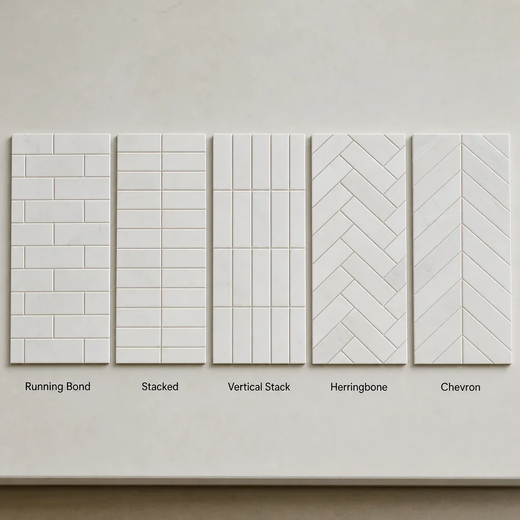
The right backsplash pattern ideas do more than fill a wall. They change how your whole kitchen reads, from calm and tailored to busy and bold.
Backsplash Pattern Ideas at a Glance
Pattern, shape, material, finish, and height are five separate decisions. A running bond layout is a pattern, subway is a tile shape family, ceramic and porcelain are materials, gloss and matte are finishes, and full-height or counter-to-cabinet is the installation height.
Most homeowners compare the same core backsplash pattern names. Running bond, stacked, vertical stack, herringbone, chevron, grid, basketweave, checkerboard, mosaic, and geometric layouts cover most real kitchen decisions.
The best quick-pick guide is simple. Running bond is the safest timeless choice, stacked works for a cleaner modern look, vertical stack helps a kitchen feel taller, herringbone adds movement, and larger-format tile with matched grout is usually the easiest-clean option because it creates fewer grout joints.
The right layout depends on what is already busy in the room. Countertop veining, cabinet style, light levels, wall straightness, grout contrast, and your tolerance for visual movement matter more than trend lists.
| Pattern | Look | Best for | Watch for |
|---|---|---|---|
| Running bond | Classic, soft | Transitional and timeless kitchens | Can look less crisp in very modern spaces |
| Stacked horizontal | Clean, ordered | Flat-panel cabinets, slab counters | Shows wall unevenness more |
| Vertical stack | Taller, architectural | Small kitchens, modern kitchens | Needs careful outlet planning |
| Herringbone | Lively, custom | Feature walls, range areas | More cuts and more layout planning |
| Chevron | Sharp, formal | Symmetrical focal walls | Precision matters most |
| Grid | Quiet, balanced | Square tile and restrained palettes | Can feel plain without texture |
| Mosaic/geometric | Decorative, layered | Accent zones | Can compete with busy countertops |
Most Popular Backsplash Tile Patterns and What They Look Like
Running bond uses offset rows, usually with subway tile, and gives a softer traditional rhythm. It is one of the most forgiving back splash patterns when walls are slightly imperfect because the stagger breaks up long alignment lines.
Stacked horizontal lines tiles up in straight rows and columns. It feels cleaner and more architectural than running bond, but it also shows uneven walls and drifting grout lines faster because every joint must stay aligned.
Vertical stack takes that same order and turns it upward. It is one of the strongest modern kitchen backsplash ideas because the eye travels up, which can help compact kitchens feel taller.
Herringbone sets rectangular tile at right angles to create a zigzag effect. It adds movement and custom character, which is why it shows up so often in backsplash tile pattern ideas behind a range or open shelving wall.
Chevron creates a continuous V shape with mirrored tile edges. It looks sharper and more formal than herringbone, but it needs more exact cuts and cleaner symmetry to look intentional.
Grid layouts use square or rectangular tile in even rows without offset. They suit quieter kitchens well, especially when the countertop has movement and the backsplash needs to support rather than compete.
Basketweave, checkerboard, fish scale, hex, diamond, and mosaic layouts create stronger personality. These different backsplash patterns work best when the rest of the kitchen is restrained, because every extra grout line increases visual activity.
Ceramic tile works in nearly all of these layouts. Ceramic tile patterns for kitchen backsplash applications are popular because ceramic comes in subway, square, handmade-look, and decorative formats, which makes it flexible for both classic and more current designs.
Running Bond vs Stacked vs Herringbone vs Chevron: How to Choose
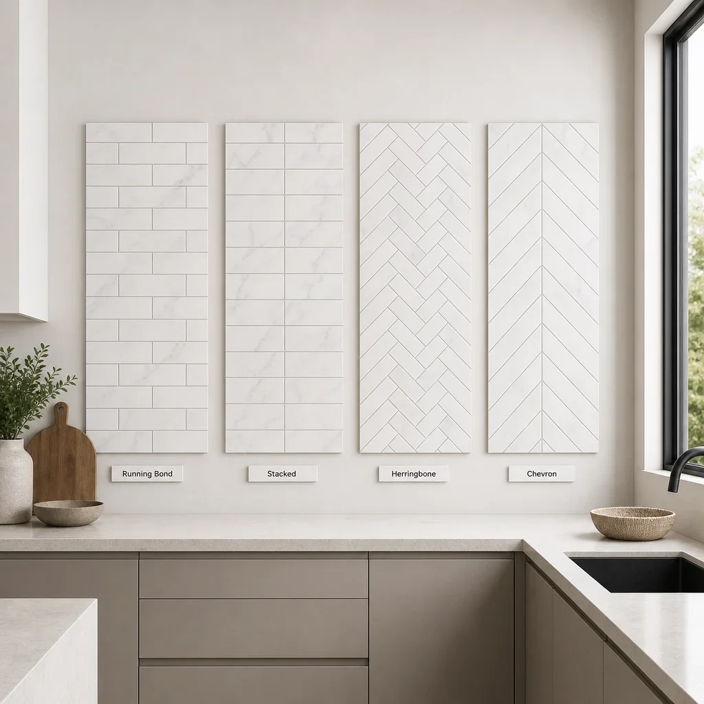
Running bond is the easiest of the four to live with long term because it feels familiar and forgiving. It usually suits shaker cabinetry, mixed finishes, and kitchens where you want the backsplash to support the room rather than lead it.
Stacked tile reads cleaner and more modern than a staggered layout. It works especially well with flat-panel cabinets, simple slab countertops, and low-contrast colour palettes where straight lines are part of the design language.
Herringbone adds more motion than either running bond or stacked. That makes it useful when plain tile still feels too quiet, but it also means the layout needs more planning around outlets, corners, and hood lines.
Chevron is usually the most formal and the least forgiving choice in this group. If the room has strong symmetry and a clear focal wall, it can look exceptional, but weak alignment stands out immediately.
Install complexity rises as the layout gets more directional. Running bond is lower complexity, stacked is lower to medium, herringbone is medium to higher, and chevron is higher because precision and cuts matter more.
Grid and staggered are another comparison people mix up. A grid layout aligns joints vertically and horizontally, while a staggered layout offsets each row, so the same tile can feel either crisp and contemporary or softer and more traditional.
Timeless vs Trendy: What Backsplash Patterns Age Well?
The backsplash that rarely dates fastest is the one that keeps the pattern simple and the palette controlled. Running bond subway tile, restrained stone looks, low-contrast grout, and well-proportioned full-height applications tend to age better than novelty shapes used across every wall.
The strongest kitchen backsplash trends 2026 conversations are less about one winning pattern and more about direction. We are seeing more oversized vertical stack layouts, textured handmade-look tile, stone slab backsplashes, saturated colour, and sculptural surfaces in design-forward kitchens, but your actual best choice still depends on the cabinets, counters, and light in the room.
The safest way to use trend is through one variable, not four at once. A classic layout in a newer colour, or a timeless tile in a more current orientation, usually ages better than combining a strong shape, strong grout, strong colour, and busy countertop together.
The backsplash to avoid is usually a mismatch, not a single material or pattern. Busy tile with heavily veined counters, trendy colour with trendy cabinetry, or high-contrast grout in a kitchen that needs a lower-maintenance appearance are the combinations that tire fastest.
How to Match a Backsplash Pattern With Countertops, Cabinets, and Appliance Finishes
Your backsplash does not need to be lighter or darker than the countertop to work. Either direction can look right, because the better rule is contrast control: if the slab is busy, the backsplash should usually quiet the room, and if the slab is plain, the backsplash can carry more design weight.
White cabinets give you the widest range of options. Different backsplash patterns with white cabinets can go crisp and modern with stacked gloss tile, warmer and softer with handmade-look ceramic in running bond, or more graphic with a controlled herringbone and matched undertones.
Wood cabinets usually benefit from a backsplash that respects their warmth. Creams, greiges, muted greens, clay tones, and stone-inspired colours tend to pair better than icy whites unless the wood tone is intentionally cool.
Flat-panel cabinets support cleaner backsplash tile designs patterns. Stacked, grid, or full-height slab-style looks usually fit better than highly decorative mosaics because the cabinet style already points the room toward minimal lines.
Shaker kitchens can handle more rhythm without looking forced. Running bond, basketweave accents, and softer ceramic tile backsplash designs patterns often sit naturally with their more traditional profile.
Grout colour can completely change the same tile. Matched grout makes the backsplash read calmer and larger, while contrasting grout turns every joint into a graphic line and makes the pattern itself more visible.
The colours that make a kitchen look expensive are usually layered neutrals, not louder contrast. Warm whites, natural stone tones, soft taupes, muted mineral shades, and black used with restraint tend to create a more composed high-end feel.
Small Kitchen vs Large Kitchen: Which Backsplash Patterns Work Best?
Small kitchens usually look better with quieter layouts and fewer visual interruptions. Light colours, fewer cuts, modest pattern contrast, and tile formats that do not fragment the wall too much are strong small kitchen backsplash ideas.
Vertical stack can help a compact kitchen feel taller. Horizontal layouts emphasize width more, so the better option depends on whether the room feels low, narrow, or simply crowded with competing finishes.
Large kitchens can support stronger movement because there is more visual breathing room. Herringbone, larger feature zones behind the stove, richer colour, or full-wall backsplash treatment can work well when the room has long sightlines and fewer uppers.
Open-shelf kitchens are a good place for full-height tile. When upper cabinets are limited or absent, the backsplash becomes more architectural, so pattern and material choices carry more of the room’s finished character.
How Tile Size Changes the Pattern Outcome
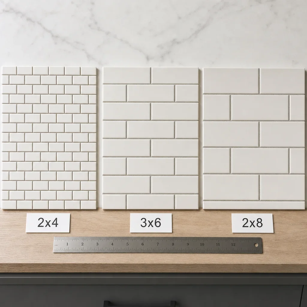
Tile size can change the same layout more than most homeowners expect. Smaller tile creates more grout lines and more texture, while larger tile makes the same pattern feel calmer and more contemporary.
A 2×4 tile in running bond reads more traditional than a 2×8 or elongated subway in that same offset layout. Aspect ratio changes the rhythm, so the pattern may stay constant while the style shifts from classic to transitional to modern.
The common comparison sizes homeowners review include 2×4, 3×6, and 2×8 rectangular tile. Those examples are useful because they show how ceramic tile patterns for kitchen backsplash walls can move from busy to restrained without changing the basic pattern family.
Handmade-look and zellige-style tile soften strict layouts because edges and surfaces are less uniform. In a stacked layout, that can feel intentionally artisanal, while in a high-contrast geometric pattern it can reduce the crispness people expect.
Backsplash Height and Direction: Standard, Full-Height, and Ceiling-Height Options
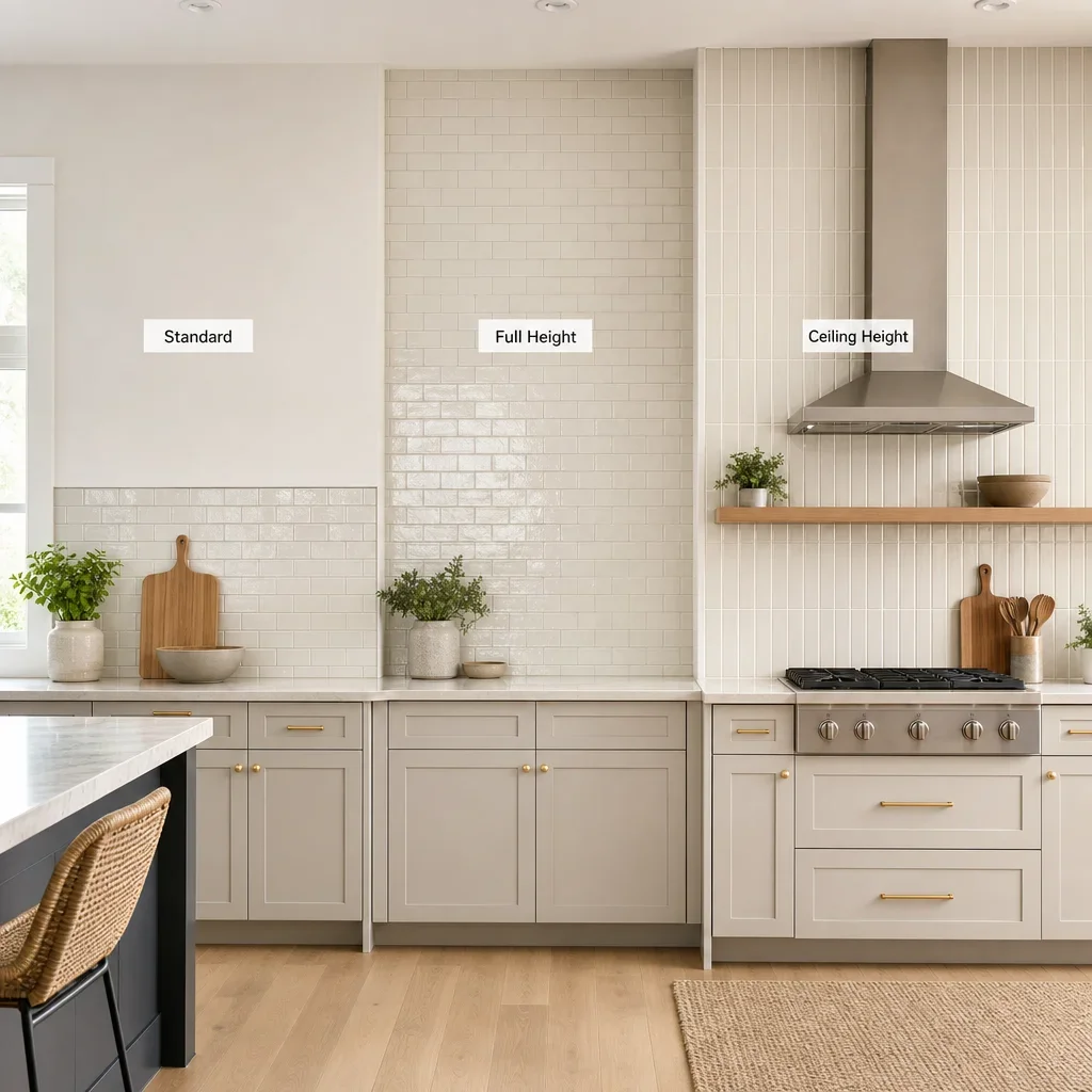
The most common backsplash height runs from the countertop to the underside of the upper cabinets, which is often about 18–20 inches in many kitchens.
A short counter splash can work, but it usually feels less finished in a renovated kitchen unless the design is intentionally minimal. Full-height sections, especially behind a range hood or open shelving, create a stronger architectural result because the tile reads as wall treatment rather than a narrow strip.
Horizontal direction feels calmer and more familiar. Vertical direction feels more current and architectural, which is why it appears so often in modern kitchen backsplash ideas and decorative tile backsplash behind stove feature areas.
The best rule of thumb is line alignment, not a universal height. When the tile starts and stops with cabinet lines, hood width, shelf placement, and window trim in mind, the kitchen feels resolved instead of patched together.
How to Plan Backsplash Tile Layout Before Installation
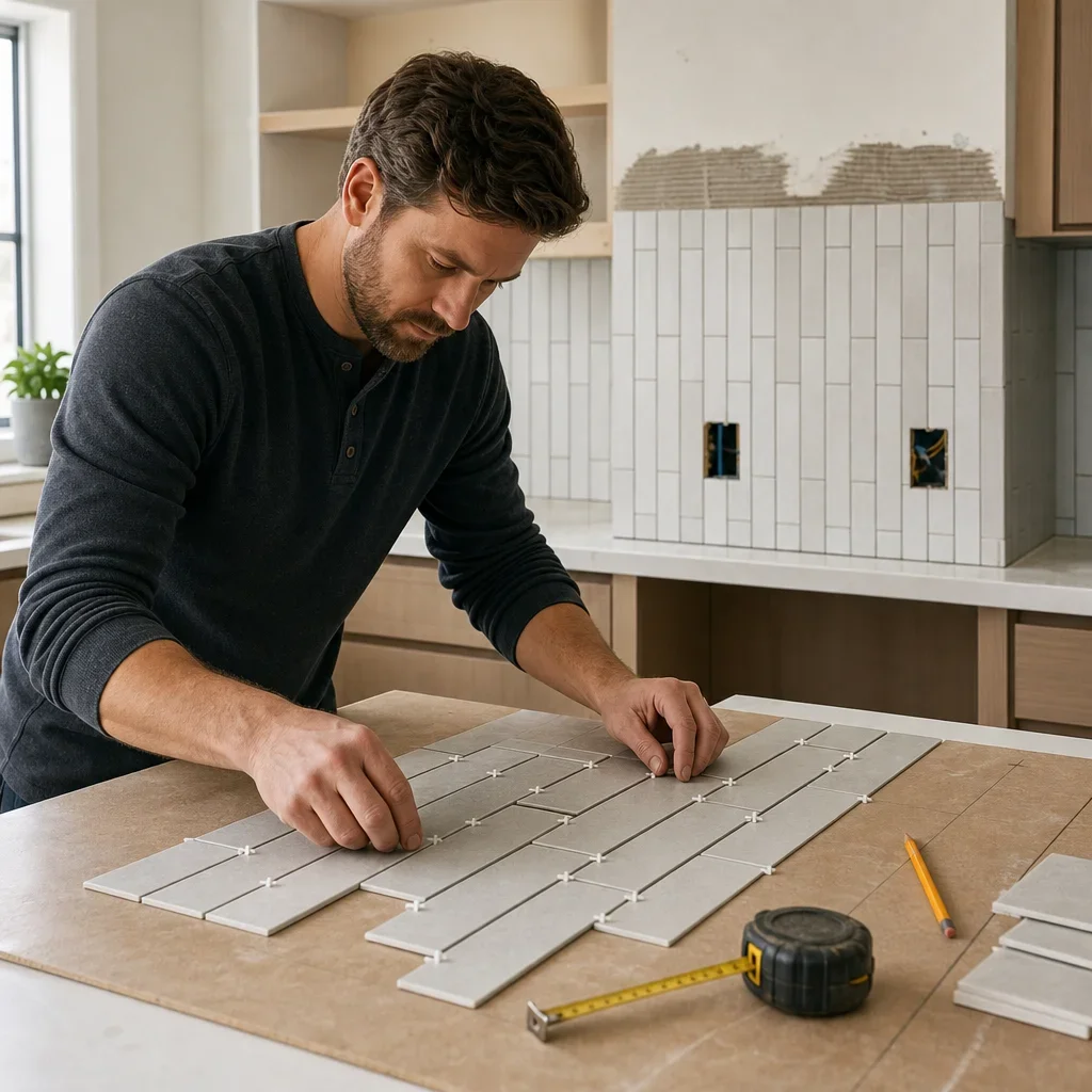
Start the layout from the strongest focal line in the kitchen. That is usually the range hood, sink window, open shelf section, or the most visible uninterrupted wall.
A dry layout prevents bad cuts later. Setting tile out before installation shows where joints land at outlets, corners, and end walls, which is the only reliable way to catch slivers before thinset goes on the wall.
The goal is balanced cuts, not forced symmetry everywhere. A centred layout at the hood may matter more than perfect symmetry at a hidden end run, and avoiding tiny slivers at the edges usually improves the final look.
Grout joint width affects finished dimensions and pattern alignment. Even a small joint repeated across a wall changes where cuts fall, so the exact tile and manufacturer spacing recommendation should be confirmed before layout is finalized.
The 3-4-5 rule is a general squaring method used in construction and tile work, not a backsplash design rule by itself. It helps establish a true right angle, but most backsplash planning questions are really about focal points, balance, and interruptions rather than field squaring alone.
Corners, Outlets, Windows, and Range Hoods: Layout Details That Make or Break the Finish
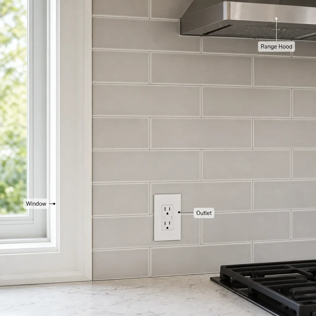
Corners should look intentional, not accidental. Some patterns continue around inside corners, while others are better reset so the visual break looks clean instead of warped.
Outlets become more visible as the pattern becomes more directional. High-contrast grout, herringbone, chevron, and narrow vertical stacks make outlet cuts stand out faster, which is why plate placement and joint lines need early planning.
Windows and range hoods usually deserve centred alignment. If the kitchen has one obvious focal wall, the eye notices whether the tile is balanced there long before it notices minor cut differences elsewhere.
A decorative tile backsplash behind stove can either match the field tile or become its own accent panel. The cleaner choice in most premium kitchens is to keep one language across the wall unless the accent is clearly framed by the hood, shelves, or surrounding material.
Shelf brackets, pot fillers, switches, and wall returns should be measured before ordering tile. Directional layouts need more coordination because every interruption changes where cuts, joints, and termination lines land.
Grout, Edge Trim, and Termination Details
Grout is not a small decision because it controls whether the pattern whispers or shouts. Matched grout softens different backsplash patterns, while darker or contrasting grout highlights every joint and makes the layout itself a design feature.
Glossy tile usually shows the pattern more clearly under under-cabinet lighting. Matte and textured surfaces diffuse light more, which can make the wall feel quieter even when the tile layout stays the same.
Open tile edges need a finish plan before installation starts. Tile returns, metal trim profiles, pencil trim, stone trim, and stopping at cabinet lines or natural wall transitions are all valid, but each gives a different level of formality.
Termination points matter most at exposed ends, window wraps, and where tile meets painted drywall. A beautiful field tile can still look amateur if the edge dies in the wrong place or if the trim was treated as an afterthought.
Material Choices: Ceramic, Porcelain, Glass, Stone, Zellige-Style, and Slab
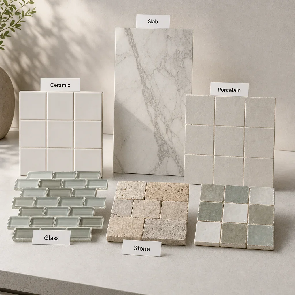
Ceramic is one of the most flexible backsplash materials for pattern work. Ceramic tile backsplash designs patterns come in clean machine-made formats, handmade-look surfaces, gloss finishes, and colour ranges that suit both classic and contemporary kitchens.
Porcelain is usually chosen for its lower-maintenance feel and crisp manufacturing. It works well when you want a cleaner modern look, tighter repetition, or a material that handles kitchen cleanup well.
Glass reflects more light than most other tile surfaces. That makes it useful in darker kitchens, but it also means smudges, setting quality, and wall flatness can become more noticeable.
Natural stone adds depth and variation, but it needs more care than ceramic or porcelain. The exact maintenance depends on the stone and finish, so sealing and cleaning requirements should be confirmed for the specific product before you commit.
Handmade-look and zellige-style tile add texture and irregularity. They are excellent for softening strict backsplash tile layout patterns, but they are less uniform, so pattern lines read differently than they do with machine-made ceramic.
Slab backsplash options reduce grout lines almost to zero. That creates a cleaner premium look and works especially well with dramatic countertops, though the best fit depends on the slab movement and the overall renovation budget.
Common Backsplash Mistakes to Avoid
The most common mistake is combining too many strong elements at once. A busy countertop, bold tile pattern, contrasting grout, and statement hardware can all work individually, but together they often make the kitchen feel crowded.
Undertone mismatch is another frequent problem. Warm cabinets with cool grey tile, creamy counters with blue-white backsplash, or black accents with unrelated beige undertones can make expensive finishes look disconnected.
Poor edge termination can ruin otherwise good tile work. If the layout has no planned stopping point at the end of a run, near a window, or beside open wall space, the installation can feel unfinished.
Outlets and hood alignment should never be left to the last minute. Awkward cuts around electrical boxes and off-centre pattern lines at the hood are among the first details people notice in a finished kitchen.
Highly textured or porous materials need a realistic cleaning conversation before selection. If you cook frequently and want a low-maintenance surface, heavily pitted or irregular products may not match how you use the kitchen.
Use this pre-commit checklist before ordering tile. Review the sample in daylight, under-cabinet lighting, and evening light; place it beside the exact cabinet door and countertop sample; and confirm the grout colour before final signoff.
DIY or Hire a Pro?
Simple running bond or stacked tile is the most DIY-friendly category, but layout quality still decides whether the result looks premium. Substrate prep, level lines, outlet cuts, spacing, and edge details matter as much as placing the tile itself.
Herringbone, chevron, handmade-look tile, and full-height installs need more precision. They are less forgiving of drift, inconsistent joints, poor corner planning, and weak termination details, so the visual standard is harder to hit without experience.
Professional installation adds the most value when the backsplash coordinates with cabinets, counters, lighting, trim, and hood work. In a full renovation, that sequencing is often what separates a good idea on a sample board from a kitchen that feels fully resolved.
Best Backsplash Pattern Ideas by Kitchen Style
Modern kitchens usually look best with restraint and line clarity. Stacked horizontal, vertical stack, grid layouts, larger-format tile, and slab-style looks all support flat-panel cabinetry and simpler hardware well.
Transitional kitchens have the broadest range. Running bond, softened herringbone, handmade-look ceramic, and subtle backsplash patterns with subway tile usually sit comfortably between classic cabinet profiles and cleaner contemporary counters.
Traditional kitchens respond well to familiar rhythm. Running bond, basketweave accents, checkerboard details used sparingly, and warmer ceramic tile patterns for kitchen backsplash walls suit shaker doors, crown detail, and layered finishes.
Scandinavian-inspired kitchens benefit from quiet palettes and light texture. A pale stacked tile, matte square grid, or soft off-white vertical stack usually gives enough detail without disrupting the calm.
Luxury contemporary kitchens can carry more drama if the room stays disciplined elsewhere. Full-height slab-style backsplashes, elongated tile in strong proportion, controlled veining, and sculptural surfaces work best when the cabinetry and lighting remain edited.
When to Bring These Ideas Into a Full Kitchen Renovation Plan
Backsplash decisions should usually be finalized after cabinet style, countertop selection, hood design, and lighting layout are set. The tile is a finishing layer, but it works best when it is coordinated early enough to respond to the larger composition.
A backsplash almost always looks more expensive when it is chosen with the whole room in mind. That includes cabinet colour, counter movement, outlet placement, shelf details, appliance finish, and where the tile starts and stops.
If you are planning a larger kitchen remodel, bring tile decisions into the design stage instead of treating them as the last quick pick. On full kitchen and [home renovation Toronto](/home-renovation-toronto) projects, and even adjacent updates like [bathroom renovation Toronto](/bathroom-renovation-toronto), we see the best results when finishes are coordinated as one system rather than selected in isolation.
If you want a second set of eyes before you commit, a design consultation can help you compare layout, material, grout, and edge details against your actual cabinets and counters. That is usually where good kitchen backsplash tile ideas turn into the right one for your space.
FAQ
What backsplash pattern should I choose for my kitchen?
Choose the pattern that balances what is already happening in the room. If your countertop has strong movement, go quieter with running bond, stacked, or grid; if the countertop is plain, herringbone or a more decorative layout can take on more of the design work.
What is the difference between running bond and stacked tile?
Running bond offsets each row, which creates a softer classic rhythm. Stacked tile aligns rows and joints vertically, which creates a cleaner and more modern look.
Is herringbone or chevron better for a kitchen backsplash?
Herringbone is usually easier to blend into more kitchen styles because it feels custom but less formal. Chevron looks sharper and more symmetrical, so it works best when the wall and focal points are precise enough to support that level of order.
Should the backsplash be lighter or darker than the countertop?
Either can work. The better rule is to control contrast and movement so the backsplash and countertop support each other instead of competing.
What backsplash pattern never goes out of style?
Simple subway tile in running bond stays one of the most reliable timeless choices. Low-contrast grout and a restrained colour palette help it age even better.
What backsplash trends should I avoid?
Avoid combinations that stack too many strong moves together. Busy pattern, busy stone, strong grout, and trend-led colour all at once is a higher-risk mix than any single trend by itself.
How do I plan a backsplash tile layout?
Start from the main focal point, dry-lay the tile, account for grout-joint width, and check cuts at outlets, corners, and wall ends before installation. Balanced cuts usually matter more than forcing perfect symmetry everywhere.
What are the most common backsplash mistakes?
The biggest ones are poor coordination with the countertop, too much grout contrast, unplanned edge termination, awkward outlet cuts, and choosing a pattern without testing it in the kitchen’s actual light.
Can subway tile be installed in different patterns?
Yes. Subway tile works in running bond, stacked horizontal, vertical stack, herringbone, basketweave, and other backsplash tile layout patterns, which is why it remains so flexible in renovation design.
Which backsplash patterns work best in a small kitchen?
Quieter layouts usually work best. Stacked, running bond, vertical stack, and soft grid layouts in lighter tones tend to keep a smaller kitchen feeling more open.
Does grout colour change how the backsplash pattern looks?
Yes, dramatically. Matching grout softens the tile field, while contrasting grout highlights every joint and makes the pattern more graphic.
Should I take the backsplash to the ceiling?
Take it to the ceiling when the wall needs stronger architectural presence, especially around a hood wall, open shelves, or kitchens with fewer upper cabinets. In more standard layouts, counter-to-cabinet height is still a clean and appropriate choice.
If you are still narrowing it down, bring home fewer tile options and compare them against your real cabinet and countertop samples. The kitchen usually answers the question once the materials are side by side.
