 Instagram
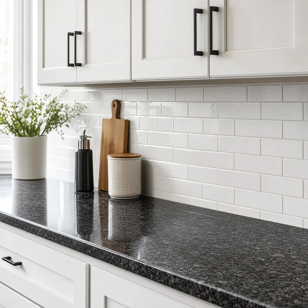
The hardest kitchens to finish are usually the ones that look simplest. With backsplash ideas for white cabinets and granite countertops, the right answer is rarely “pick the prettiest tile sample.” It starts with how busy the counter is, how warm or cool the white reads, and whether you want the backsplash to disappear, soften, or add contrast.
Best backsplash ideas for white cabinets with granite, black, or dark countertops
The safest rule is simple: busy countertops need calmer backsplashes, while solid dark counters can handle more texture or pattern. White cabinets already give you one clean surface, so the backsplash should either support the counter or gently break up the contrast.
White or warm white subway tile is still the easiest timeless choice because it works with both patterned granite and plain black surfaces. It reads clean, suits traditional through modern kitchens, and gives you flexibility with wall paint, flooring, and hardware later.
Soft greige, taupe, and light gray tile usually work better than stark bright white when the countertop has beige, brown, or gold movement. Those tones connect to warmer granite without making the kitchen feel yellow or heavy.
Marble-look porcelain and quiet veined tile are strong choices when you want a slightly more finished look than plain subway but still need restraint. They give movement, but the pattern stays controlled enough that it does not fight with the rest of the kitchen.
Zellige-look tile and handmade-look ceramics are useful when the countertop is solid black, charcoal, or soapstone-like because the backsplash can carry the softer visual texture. The result feels layered instead of flat, especially in kitchens with simple shaker doors.
A full-height slab backsplash is one of the cleanest premium options for modern kitchens, especially with black quartz, charcoal quartz, or dark stone with low movement. Fewer grout lines mean a quieter wall and easier wipe-down in splash zones.
If you want a fast shortlist, these are the best overall picks: white subway for timeless style, warm greige tile for warmth, slab or large-format porcelain for luxury, glossy light tile for small kitchens, and handmade-look neutrals for softness with dark counters.
How to choose the right backsplash: match, contrast, or balance?
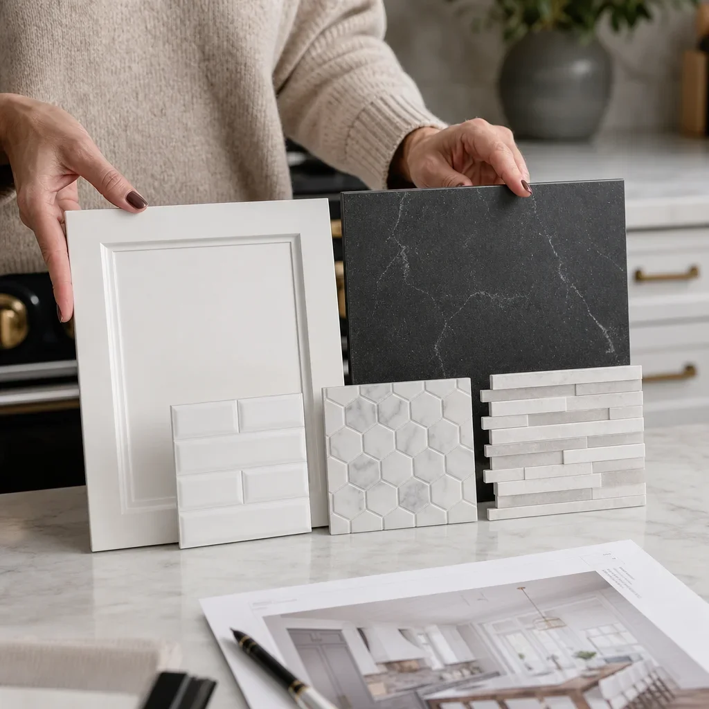
There are 3 reliable ways to choose a backsplash: match the cabinet tone, relate to the countertop undertone, or create deliberate contrast. Most good kitchens use balance rather than a strict match, because white cabinets and dark counters already have built-in contrast.
Matching the cabinet tone works best when you want the backsplash to fade into the room and make the kitchen feel larger. This is why white-on-white kitchens stay popular, especially in smaller layouts or spaces with limited natural light.
Relating to the countertop undertone is the safest move when the stone has visible movement, flecks, or veining. If the granite leans beige, taupe, or brown, a warm neutral backsplash will usually feel more connected than an icy white.
Creating contrast works best when the countertop is solid or nearly solid, like black quartz or some soapstone-style surfaces. In that case, the backsplash can carry more shape, stacked layouts, or subtle variation without making the room feel crowded.
A lighter backsplash usually makes white cabinets and dark countertops feel more open, while a mid-tone or darker backsplash makes them feel moodier and more architectural. Neither is automatically better, but lighter is the safer choice for brightness and darker is the stronger choice for drama.
The countertop should usually remain the visual anchor when it has obvious pattern or movement. I tell clients to compare the noise level, not just the colour, because a speckled granite and a busy mosaic can make even a large kitchen feel unsettled.
Backsplash color guide for white cabinets and dark countertops
Crisp white works best when the cabinets are a true white, the counters are solid black or cool charcoal, and the overall kitchen leans modern. It gives strong contrast and keeps the room sharp, especially with stainless steel or black hardware.
Warm white and ivory are better choices when the cabinets are creamy, the flooring is oak or walnut, or the granite carries beige or gold undertones. This is often the answer to what color backsplash looks good with granite countertops that do not read purely gray or black.
Greige is one of the most flexible colours for a backsplash for white cabinets and dark countertops because it bridges warm and cool finishes. It can connect white cabinetry to dark stone without pushing the room too beige or too cold.
Soft gray works best with black quartz, charcoal counters, and cooler paint palettes. It tones down high contrast and keeps a modern white kitchen with black countertops from feeling too stark.
Taupe and beige work well when you want warmth without obvious yellow. They also pair nicely with brass hardware, warm wood islands, and transitional kitchens that need softness.
Muted blue-gray can work in coastal or softer transitional kitchens, but it needs restraint and a clear connection to wall colour, textiles, or adjacent finishes. Used well, it adds colour without turning the backsplash into the room’s loudest feature.
Charcoal and black tile are best used selectively, usually in larger kitchens with strong lighting and simple counters. A backsplash for white cabinets and black countertop can absolutely go darker, but it needs enough openness elsewhere to avoid compressing the room.
Grout changes the look more than most homeowners expect: white grout softens, light gray is forgiving, medium gray adds definition, and charcoal makes the tile pattern stand out. The smaller the tile, the more the grout colour will shape the final read.
The colours to avoid are loud multi-colour mosaics with busy granite, blue-white tile beside creamy cabinets, and highly reflective finishes in already high-contrast kitchens. Most cheap-looking kitchens do not fail because of one bad material; they fail because undertones and pattern levels were never lined up.
Material comparison: tile, slab, glass, stone, and more
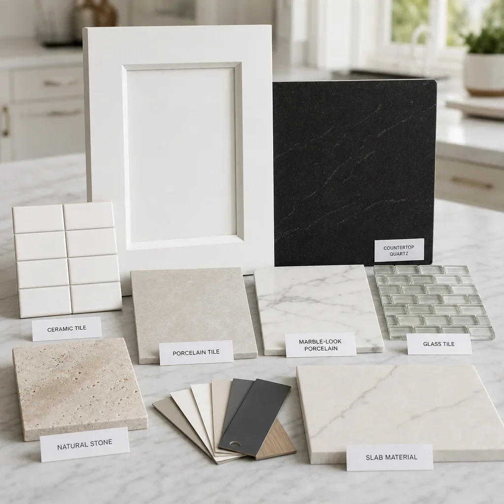
Ceramic tile is a practical budget-to-mid-range option for many kitchens because it offers lots of colours and classic shapes without pushing the wall too busy. It suits standard-height backsplashes well, but quality and edge detail matter if you want a more custom finish.
Porcelain tile is one of the most durable and low-maintenance choices for family kitchens. It can mimic marble, limestone, concrete, or handmade surfaces while usually asking less maintenance than natural stone.
Marble and marble-look tile work well when you want softness and quiet movement with white cabinets and dark countertops. Real marble gives a rich natural look, while porcelain versions are usually easier to live with day to day.
Glass tile can brighten a dimmer kitchen because glossy surfaces bounce light, but the wrong glass mosaic can look dated quickly. It works best in simple formats rather than busy mixed strips.
Natural stone tile can be beautiful beside warm granite or traditional millwork, but stone varies more and may need more attentive care than ceramic or porcelain. This is a good choice when texture and authenticity matter more than the simplest upkeep.
Quartz or stone slab backsplashes give one of the cleanest high-end results because they reduce grout lines and feel tailored to the counters. They are especially strong in contemporary kitchens and in open-concept spaces where the backsplash is visible from living and dining areas.
Zellige-look tile and handmade-look finishes are good for adding depth to simple kitchens without relying on loud pattern. The slight surface variation gives character, especially in a backsplash for white cabinets and black countertop that needs warmth.
Mosaic tile is best used sparingly because many small pieces create visual activity fast. With busy granite, it is often the first backsplash to avoid.
Brick-look tile and shiplap are niche options that can work in farmhouse or cottage-style kitchens, but they need the rest of the room to support them. They are not the universal answer if you want broad resale appeal or a more polished urban look.
Material and maintenance comparison
| Material | Best use with white cabinets and dark counters | Maintenance | Typical installed cost level in Toronto/GTA | Notes |
|---|---|---|---|---|
| Ceramic tile | Classic, simple kitchens | Low to moderate | Budget to mid-range | Good value, but finish quality varies |
| Porcelain tile | Low-maintenance family kitchens | Low | Budget to premium | Strong range of stone-look options |
| Marble-look porcelain | Timeless, softer contrast kitchens | Low | Mid-range to premium | Easier than real marble |
| Real marble tile | Luxury, traditional, or transitional kitchens | Moderate | Premium to luxury | Beautiful, but care requirements vary |
| Glass tile | Smaller kitchens needing brightness | Low to moderate | Mid-range to premium | Best in restrained formats |
| Natural stone tile | Warm, textured, classic kitchens | Moderate | Premium | Follow installer and manufacturer care guidance |
| Slab backsplash | Modern, premium, low-grout kitchens | Low to moderate | Premium to luxury | Very clean visual result |
| Handmade or zellige-look tile | Soft, organic, layered kitchens | Moderate | Mid-range to premium | Texture changes how splatter and grout read |
Finish matters: matte vs glossy vs honed vs polished
Glossy finishes make the biggest difference in smaller kitchens because they reflect light and help dark countertops feel less heavy. That makes them a smart option when the room needs brightness more than texture.
Matte finishes feel quieter and more current in many contemporary kitchens. They soften contrast and work especially well when the counters are polished and dramatic enough on their own.
Honed finishes sit between rustic and refined, which is why they pair well with soapstone-style counters, organic modern spaces, and softer cabinet colours. They reduce glare and let shape and material do more of the work.
Polished finishes usually read more formal and more luxe, especially with marble-look surfaces and dressier hardware. If the rest of the kitchen is already glossy, though, another polished surface can tip the room into feeling hard instead of layered.
Textured handmade surfaces can be beautiful, but they usually ask for more attention around cleaning lines, shadows, and grout. Smooth porcelain or slab surfaces are usually the simpler answer when low maintenance matters most.
The best finish choice usually relates to the countertop finish as much as the colour. Polished black quartz can handle softer matte tile, while a honed or soapstone-like counter often looks best with an equally quiet backsplash finish.
The backsplash-by-countertop matrix: what works with granite, black granite, quartz, soapstone, and other dark stone
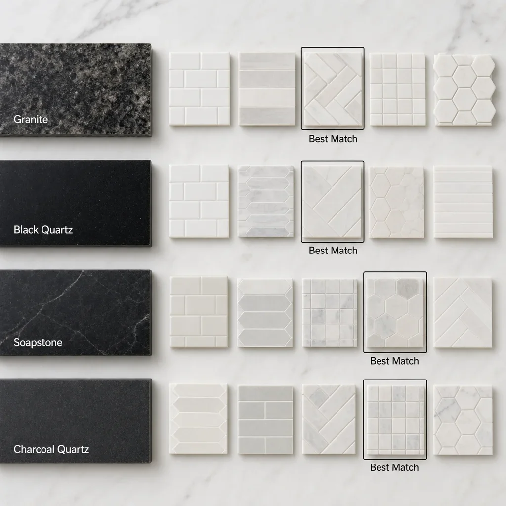
The easiest way to choose is by reading how much movement the countertop already has. The more pattern in the stone, the calmer the backsplash should be.
| Countertop type | Safest backsplash direction | Bolder backsplash direction | What to avoid |
|---|---|---|---|
| Busy beige or brown granite | Warm white, ivory, greige subway or simple porcelain | Soft taupe handmade-look tile | Multi-colour mosaics and strong veining that competes |
| White-and-black granite | Crisp white, light gray, or marble-look tile with low variation | Vertical stack in a quiet elongated tile | Busy geometric patterns and shiny strips |
| Solid black quartz | White, warm white, greige, or zellige-look tile | Fluted, stacked, or slab backsplash | Tiny high-contrast mosaics that chop up the wall |
| Black granite | Soft white or light gray with simple pattern | Honed-look larger format tile | Overly cool blue-white tile beside warm stone notes |
| Soapstone or soapstone-look surfaces | Warm white, putty, or handmade-look tile | Full-height slab or textured matte tile | Glossy busy glass that fights the softness |
| Charcoal quartz | Light gray, greige, or quiet marble-look porcelain | Picket or herringbone in a restrained colour | Loud mixed finishes and random accent inserts |
| Dark marble-look surfaces | Plain white or warm white with minimal grout contrast | Slab or large-format porcelain | Another strong veining pattern on the wall |
If you are deciding between two tiles, hold them next to the actual counter sample and cabinet door at the same time. A backsplash that looks right alone can fall apart once the stone movement and cabinet undertone are in the picture.
Pattern and layout ideas that work without overwhelming the kitchen
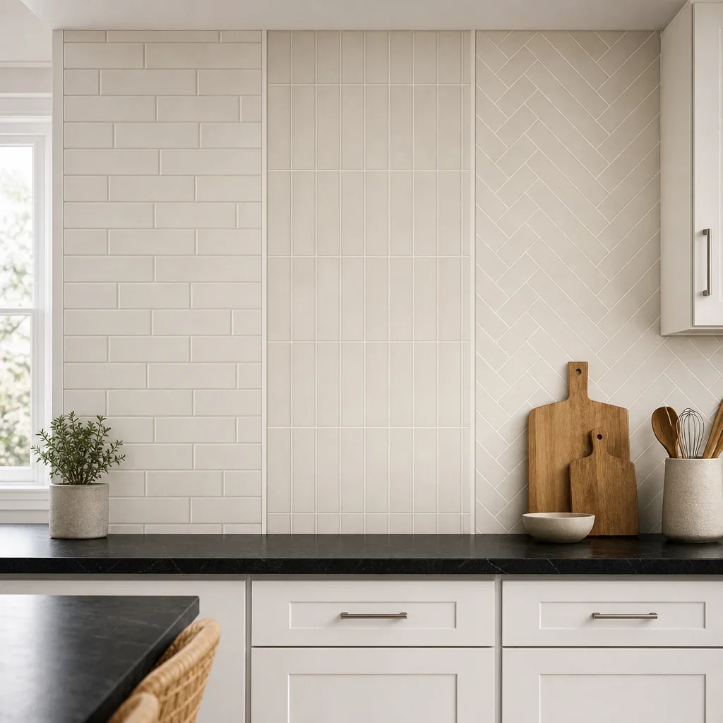
Subway tile remains popular because it is easy to scale up or down and does not trap the room in one style. It works in offset, stacked, or vertical layouts, which is why it still answers what backsplash never goes out of style better than most trends do.
A stacked layout feels cleaner and more modern than a classic running bond. This is a strong choice for white cabinets with black countertops ideas that need sharper lines and less traditional detail.
Vertical stack tile makes the wall feel taller, especially in kitchens with shorter uppers or lower ceilings. That can help smaller kitchens feel a bit more open without changing the footprint.
Herringbone adds movement, but it should be used carefully with granite that already has visible swirl or speckle. It works best when the countertop is plain enough to let the layout read clearly.
Chevron is more directional and more decorative than herringbone, so it needs a quieter room around it. In most kitchens with dark counters, this is a bolder move rather than the safest one.
Hexagon and picket tiles can look fresh if the colour is restrained and the grout is not fighting the shape. The more unusual the tile silhouette, the more important it is to keep the colour story disciplined.
Large-format tile reduces grout lines and gives a smoother visual field, which is useful if the goal is a calm, premium look. It often suits modern backsplash ideas for white cabinets and granite countertops when the homeowner wants less visual interruption.
Grout width and contrast are part of the pattern, not an afterthought. Thin joints and low-contrast grout keep the wall quieter, while darker grout turns even a simple tile into a graphic statement.
Best choice if you want warmth, luxury, low maintenance, small-space impact, high contrast, or resale appeal
If you want warmth, choose warm white, ivory, greige, or soft taupe tile with a little surface depth. This works because it softens the black-and-white contrast without making the kitchen feel beige, but bright blue-white grout can undo that warmth quickly.
If you want luxury, choose a slab backsplash or large-format marble-look porcelain with minimal grout lines. The wall feels more tailored and expensive, but this look needs careful planning around outlets, hood details, and edge transitions.
If you want low maintenance, porcelain and larger-format surfaces are usually the easiest place to start. Fewer grout lines and less absorbent surfaces usually mean simpler day-to-day care, but your actual upkeep still depends on the specific product and finish.
If you want a small kitchen to feel bigger, choose a light reflective tile with low pattern contrast. Glossy white or soft warm white often works well here, but too much shine with too much contrast can still feel busy.
If you want high contrast, choose a crisp white, light gray, or controlled dark tile with a strong simple shape. Contrast looks intentional when the pattern stays restrained, but high-contrast mosaics are often what makes a kitchen look cheap.
If you want timeless style, choose plain subway, elongated subway, or quiet marble-look porcelain in a neutral tone. These work across modern, traditional, and transitional kitchens, but the undertone still has to match the cabinet white.
If you want resale-friendly appeal, choose a backsplash that supports the whole room rather than stealing the scene. Most buyers respond better to balanced finishes than to highly personal accent strips, novelty shapes, or loud multi-colour blends.
How to warm up a black-and-white kitchen
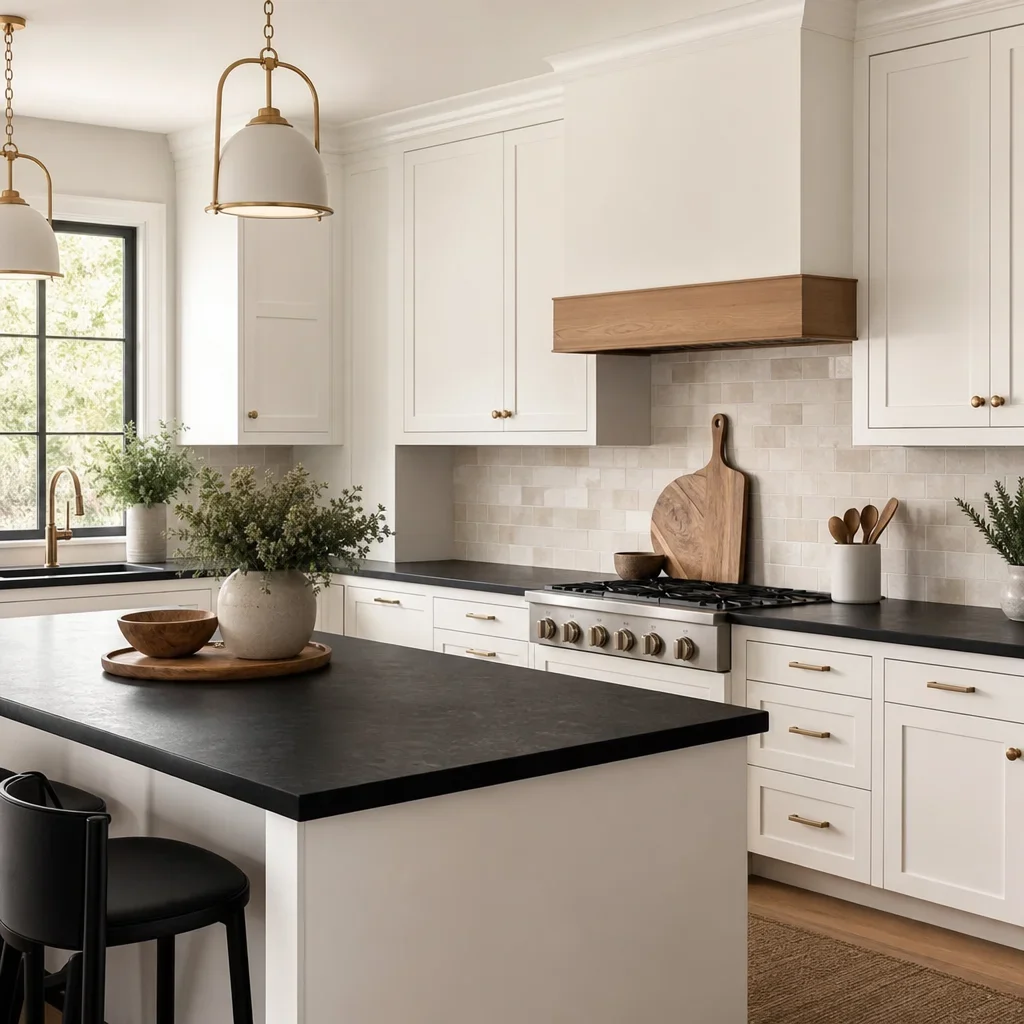
Warmth comes from undertone, texture, and supporting finishes more than from one dramatic colour. A backsplash in warm white, cream, greige, taupe, or gentle veining can take a black-and-white kitchen from stark to layered without losing the clean look.
Handmade-look tile is useful here because light hits it unevenly and gives the wall softness. That slight irregularity can make a backsplash for white cabinets and black countertop feel less flat than a perfectly uniform glossy tile.
Wood is one of the fastest ways to add warmth around the backsplash choice. Oak flooring, walnut stools, a wood island, or open shelving can all help black counters and white cabinets feel more lived in.
Metal finish matters because brass, bronze, and aged nickel usually warm a palette more than polished chrome. Black hardware can look great too, but it tends to keep the room sharper unless something else introduces warmth.
Wall colour should support the backsplash rather than fight it. Soft whites, light greiges, and gentle taupes usually make more sense than cold bright white paint when the goal is to warm up a kitchen with white cabinets and black countertops.
White cabinets with black countertops are still in style when the details are intentional and layered. What dates the look is usually not the black-and-white palette itself, but flat materials, poor undertone matching, and trend-heavy accents that were never tied together.
Style-by-style recommendations: modern, farmhouse, transitional, Scandinavian, coastal, and traditional
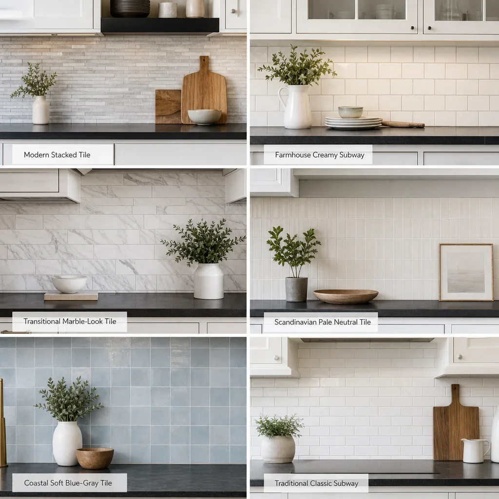
Modern kitchens look strongest with stacked tile, slab backsplashes, large-format porcelain, and minimal grout contrast. If you want a modern white kitchen with black countertops, keep the palette tight and let shape, scale, and finish do the design work.
Farmhouse kitchens usually need warmer whites, softer texture, and a little imperfection in the tile surface. Handmade-look ceramics, creamy subway, and wood accents stop the room from feeling too sharp.
Transitional kitchens do well with marble-look tile, classic shapes, and updated proportions. This is where elongated subway, herringbone used quietly, and subtle veining can bridge old and new nicely.
Scandinavian kitchens tend to prefer crisp lines, low contrast, pale neutrals, and natural wood. A quiet backsplash keeps the room airy, especially when paired with matte finishes and simple hardware.
Coastal kitchens can carry soft blue-gray or sandy neutrals, but the colour has to stay washed and controlled. With white cabinets and dark counters, this style works best when the backsplash whispers rather than shouts.
Traditional kitchens usually look best with timeless forms that respect classic millwork and more active stone. White subway, marble-inspired tile, and softer grout choices are often the better answer than trendy geometric statements.
Edge cases: open shelving, no upper cabinets, full-height backsplash, and behind-the-stove only
A full-height backsplash usually makes the biggest impact when the kitchen has few uppers, a large feature wall, or a more modern design language. It turns the wall into a finished surface rather than a narrow strip between cabinets.
Standard-height backsplash between the counter and upper cabinets is still the most flexible choice for many kitchens. It is often enough when the cabinetry already gives the room structure and the counters have visible movement.
A backsplash only behind the stove can work, but it has to look intentional within the whole elevation. In many kitchens, it reads incomplete unless another material or design move explains why the wall treatment stops there.
Open shelving makes the backsplash more visible, not less important. Since less wall is covered by cabinetry, the backsplash should usually be either quieter in pattern or more architectural in material and layout.
Kitchens without upper cabinets can handle more dramatic surfaces because there is more open wall to read the material properly. Slab, larger format tile, and vertically stacked layouts are especially strong here.
In open-concept homes, the backsplash has to work with flooring, dining furniture, and sightlines from other rooms. This is where a sample that looked great in isolation can suddenly feel too yellow, too gray, or too busy once the whole main floor is involved.
How to coordinate the backsplash with hardware, flooring, range hood, walls, and island color
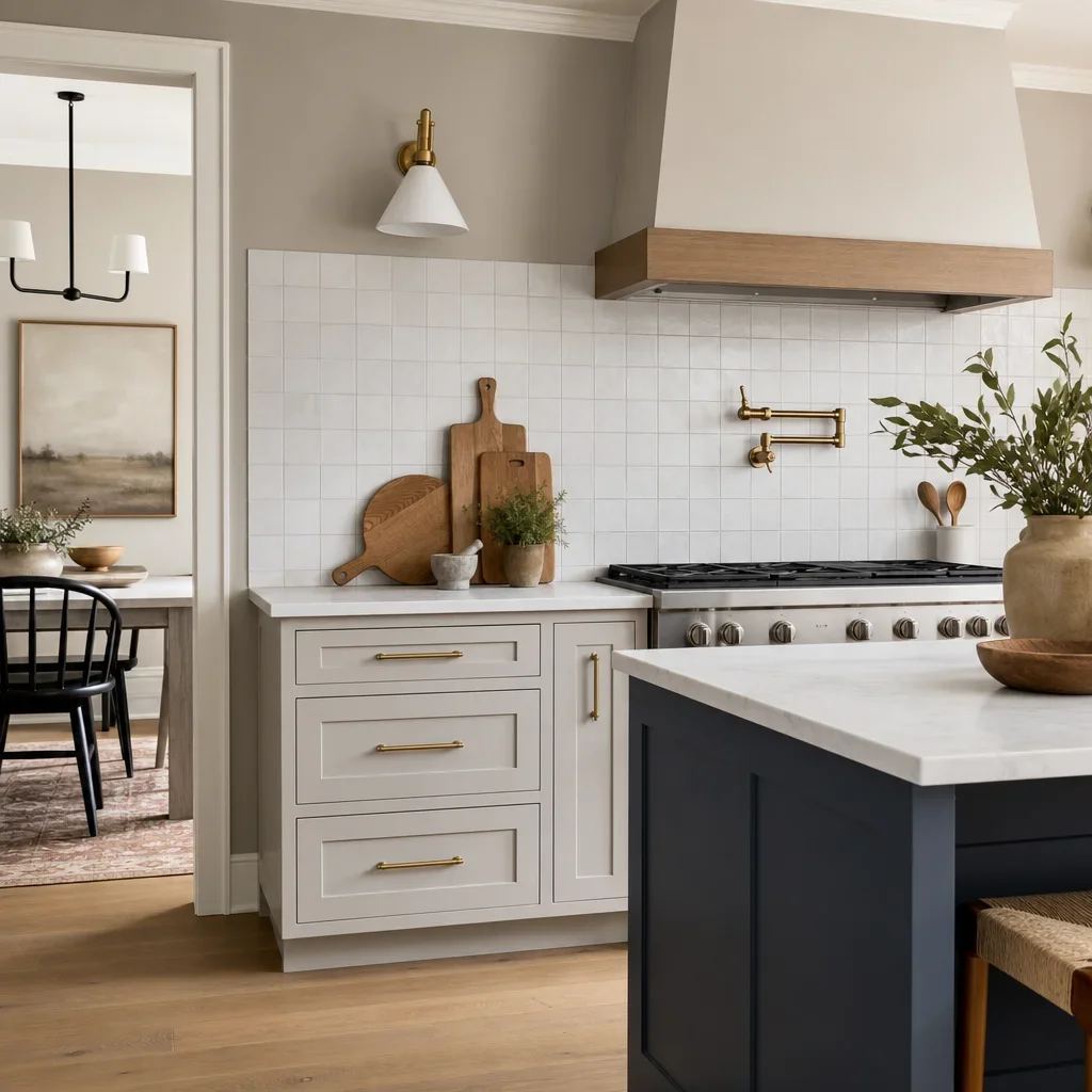
Hardware changes how the backsplash undertone reads because metal acts like a bridge between surfaces. Brass and bronze usually favour warmer whites and taupes, while chrome and stainless often sit better with cleaner whites and cooler grays.
Flooring should usually help you choose the tile temperature when the countertop could go either way. Warm wood floors support creamier whites, ivory, and greige, while cooler gray floors often make more sense with crisp whites and pale gray tile.
The range hood can become a major design connector if it is plaster, wood, or metal rather than cabinet-matched. A simple backsplash often works best when the hood is the statement piece.
Wall colour matters because the backsplash is rarely seen alone. If the wall paint is cool and the tile is creamy, the white cabinets can suddenly look dirty rather than warm.
Island colour is a useful balancing tool when the perimeter stays white and the counters go dark. A wood or painted island can pick up warmth from the backsplash and keep the room from looking split into two unrelated halves.
The simplest coordination rule is this: repeat each undertone at least twice. If the backsplash is warm, let that warmth show up again in flooring, hardware, wood, or wall paint so the choice looks intentional.
Backsplash mistakes to avoid
Too many competing patterns are what most often make a kitchen look chaotic. If the granite is active, the floor has grain, and the backsplash also has a busy mosaic, the room runs out of places for the eye to rest.
Undertone mismatch is one of the fastest ways to make good materials look wrong together. A blue-white backsplash beside creamy cabinets or beige granite can make every finish in the room look accidental.
Random accent strips and inserted feature bands are one of the easiest ways to date a kitchen. They often break up the wall for no architectural reason and pull attention to the backsplash in the wrong way.
Highly reflective, high-contrast mosaics are often the wrong move with busy granite. They multiply visual noise and can make the kitchen feel smaller, harsher, and cheaper.
Choosing from a tiny sample without seeing the cabinet, counter, and lighting together is a common mistake. Tile that looks balanced in a showroom can turn pink, gray, yellow, or stark once it is back in the actual room.
Overusing trendy shapes without considering the house style can make a renovation age faster than it should. The more trend-forward the layout, the more disciplined the colour and finish need to be.
Cheap-looking installations are often as much about execution as material. Uneven cuts, poor termination edges, sloppy grout lines, and awkward outlet placement can undermine even a good tile selection.
Peel-and-stick looks are usually not the right long-term answer for a premium permanent kitchen. They may suit a temporary stopgap, but they rarely deliver the finish quality expected in a full renovation.
Cleaning and maintenance: how to keep a backsplash looking fresh
Smooth porcelain, ceramic, and slab surfaces are usually the simplest to wipe down in everyday use. That makes them a practical choice for busy family kitchens where low maintenance matters as much as style.
Textured tile can still be a great choice, but it usually asks for a little more attention around grease, splatter, and grout lines. The deeper the surface variation, the more visible shadows and residue can become near cooking zones.
Natural stone and specialty finishes should be cleaned according to manufacturer and installer guidance because care needs vary by product. We would never treat every stone or grout the same on a renovation, and the same caution applies here.
Grout colour also affects maintenance perception because very light grout shows discolouration sooner and very dark grout can highlight residue in some lighting. If easy upkeep is the priority, mid-tone or light gray grout is often a practical middle ground.
A quick regular wipe-down keeps most backsplashes looking better than infrequent deep cleaning. The goal is not a strict universal schedule, but choosing a material and finish you will realistically maintain.
Kitchen backsplash trends for 2026: what is current, and what will still look good later
The clearest direction is toward simpler palettes, larger visual fields, and more texture instead of more colour. That includes slab looks, larger-format tile, vertical stacking, warm neutrals, handmade character, and quieter grout contrast.
Slab-style backsplashes are getting more attention because they feel clean and architectural. If you want the timeless version of that trend, choose a restrained stone look rather than a highly dramatic statement surface.
Handmade and zellige-look finishes remain relevant because they add depth without forcing a loud pattern. The safer long-term interpretation is a calm neutral tone instead of a novelty colour.
Vertical stacking and elongated tile formats feel fresher than some older accent-strip ideas. They still have longevity when the tile itself is simple and the colour belongs to the rest of the room.
Warm neutrals are replacing some colder all-gray combinations in many renovation plans. That does not mean every kitchen should turn creamy, but it does mean more homeowners are looking for softness over stark contrast.
The most durable choice is still the one that suits the cabinet white, the countertop movement, the home’s style, and your tolerance for upkeep. Trend language is useful for inspiration, but the room has to work after the trend cycle moves on.
When to bring in a kitchen renovation pro
Backsplash decisions get easier when the tile is not being chosen in isolation. Cabinets, counters, lighting, flooring, hood details, and hardware all change what the right backsplash for white cabinets and dark countertops looks like.
Most homeowners get stuck on undertone matching, where to spend, and which sample will still look good under real kitchen lighting. Those are design problems, not just shopping problems, which is why a full-room plan usually leads to a better result.
If you are planning a larger kitchen renovation in Toronto or the GTA, it helps to review the backsplash together with the cabinetry, stone, flooring, and millwork before anything is ordered. That is usually where the room stops feeling like separate decisions and starts feeling cohesive.
True Form Reno handles concept-to-completion renovation planning, so homeowners can book a design consultation when they want the backsplash choice tied into the whole kitchen rather than treated like a stand-alone tile opinion.
FAQ
What backsplash goes with white cabinets and granite countertops?
The best backsplash with white cabinets and granite countertops is usually a quieter tile than the granite itself. White, warm white, ivory, greige, light gray, and restrained marble-look porcelain are the safest places to start.
What backsplash goes with white cabinets and black countertops?
A backsplash for white cabinets and black countertop can go in two good directions: light and calming, or textured and contrast-rich. White subway, warm handmade-look tile, light gray porcelain, and slab backsplashes all work well depending on the kitchen style.
Should the backsplash be lighter or darker than the countertop?
Lighter is usually the safer choice if you want the kitchen to feel bigger and brighter. Darker can work if you want drama, but it needs enough light, wall space, and simplicity elsewhere to feel intentional.
What color backsplash for white cabinets and dark countertops?
The best colours are crisp white, warm white, ivory, greige, soft gray, taupe, beige, and muted blue-gray used carefully. The right one depends on the cabinet undertone, the counter material, and whether the room leans warm or cool.
How do you warm up a kitchen with white cabinets and black countertops?
Use a warmer backsplash tone, softer tile texture, wood elements, and warmer metals. Cream, greige, handmade-look surfaces, oak flooring, and brass hardware are all effective ways to add warmth.
What backsplash never goes out of style?
Simple subway tile, elongated subway in a calm colour, and quiet marble-look porcelain have the best track record. They stay relevant because they can shift across different kitchen styles without feeling locked to one trend cycle.
What backsplash should you avoid with busy granite?
Avoid loud mosaics, heavy veining, random accent strips, and high-contrast geometric patterns. If the granite already has movement, the backsplash should usually calm the wall down.
Are white cabinets with black countertops still in style?
Yes, when the materials are layered well. The look stays current when the backsplash, hardware, flooring, and paint soften or refine the contrast instead of making it harsher.
What backsplash material is easiest to maintain?
Porcelain, ceramic, and slab-style surfaces are usually the easiest to maintain because they are smoother and often have fewer grout lines. Your actual upkeep depends on the specific material, finish, and grout choice.
Should you do a full-height backsplash or standard height?
Full height usually makes sense in modern kitchens, open shelving layouts, and kitchens without upper cabinets. Standard height still works very well when you want a classic look or the counters already provide enough visual interest.
If you are collecting samples now, bring home fewer options and compare them beside the actual cabinet and countertop in daylight and at night. That one step usually tells you more than ten Pinterest boards ever will.
